Exhibition: Beauty Can Be the Opposite of a Number
Beauty Can Be the Opposite of a Number Uri Aran, René Daniëls, Rochelle Feinstein, Peter Hujar, Quintessa Matranga, Libby Rothfeld, Martin Wong January 31 - March 8 2020
Dear Jenny,
I’m working on an exhibition which I think is about naming and codes of language and how wonderfully slippery those codes can be: how a depiction of a thing is separate from its name, and the many ways that the depiction and the name can diverge and intersect. I wanted to write to you because so much of your poetry is about the slipperiness in constructing meaning, but also the belief in how words can be simple and economical while also bearing immense depths and intricacies. Our decades-long friendship has been built in part on an implicit love of language and its logic – and illogic. I hope you don’t mind that I used a line from your last book as the title for the exhibition, “Beauty can be the opposite of a number,” and here, the book’s first line:
“There is a window of time to make language how the mind works. Words as milk so the mind survives on language.”*
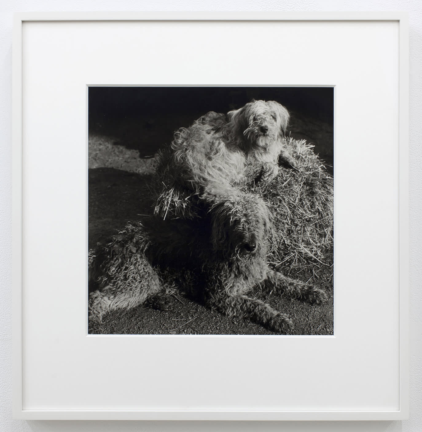
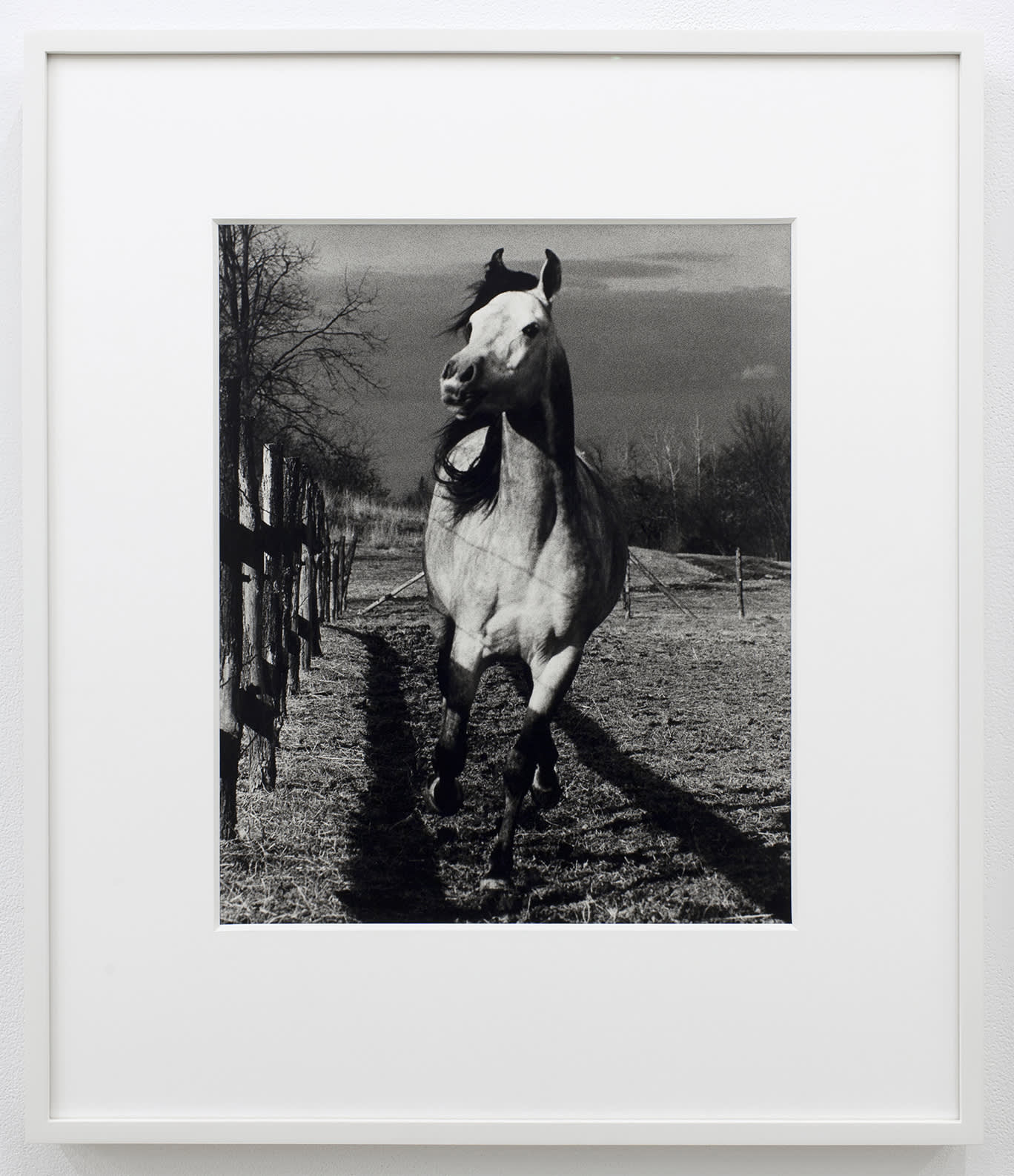
The exhibition is intergenerational and includes painting, sculpture, photography, and video. Two silver gelatin photographs by the late, great Peter Hujar are strange and beautiful outliers in the show. One features two scruffy dogs lying nestled in a dense mess of hay with oblique light streaming in from an out-of-frame source. It looks like a dusty barn in the morning. The other photograph shows an unbridled horse running towards the camera. Hujar is well-known for his portraits of humans – friends, lovers – but his animal portraits share the incredible empathy and pathos with which he captured his subjects. I’m certain that these two pictures of non-verbal beings is a kind of clue to the show. I’m probably projecting onto the animals as “innocent observers” of the mayhem of language found in the other works.
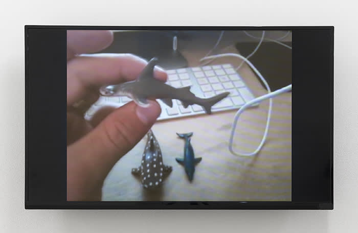
Uri Aran’s video, ‘Untitled (I Love You)’, shows the artist’s hands at a desk picking up small figurines of sea creatures from a shoebox full of maps. Each object is held like a talisman. The artist’s fingertips consider the objects haptically as he divines a meaning intrinsic to each one, which he then names with a word or phrase. The group of plastic animals is lined up and then played like a synthesizer; when touched, its phrase is recited: “I love you,” “Stay,” “I have respect for you and you’re beautiful...” The piece is so intimate and strange; the naming of these plastic toys feels so absurd and nonsensical but also so undeniable and true. I think the intimacy of the work comes from the feeling that we viewers are privy to the very personal space of the artist’s contemplation about a lover slipping away. It feels so candid and uncensored.
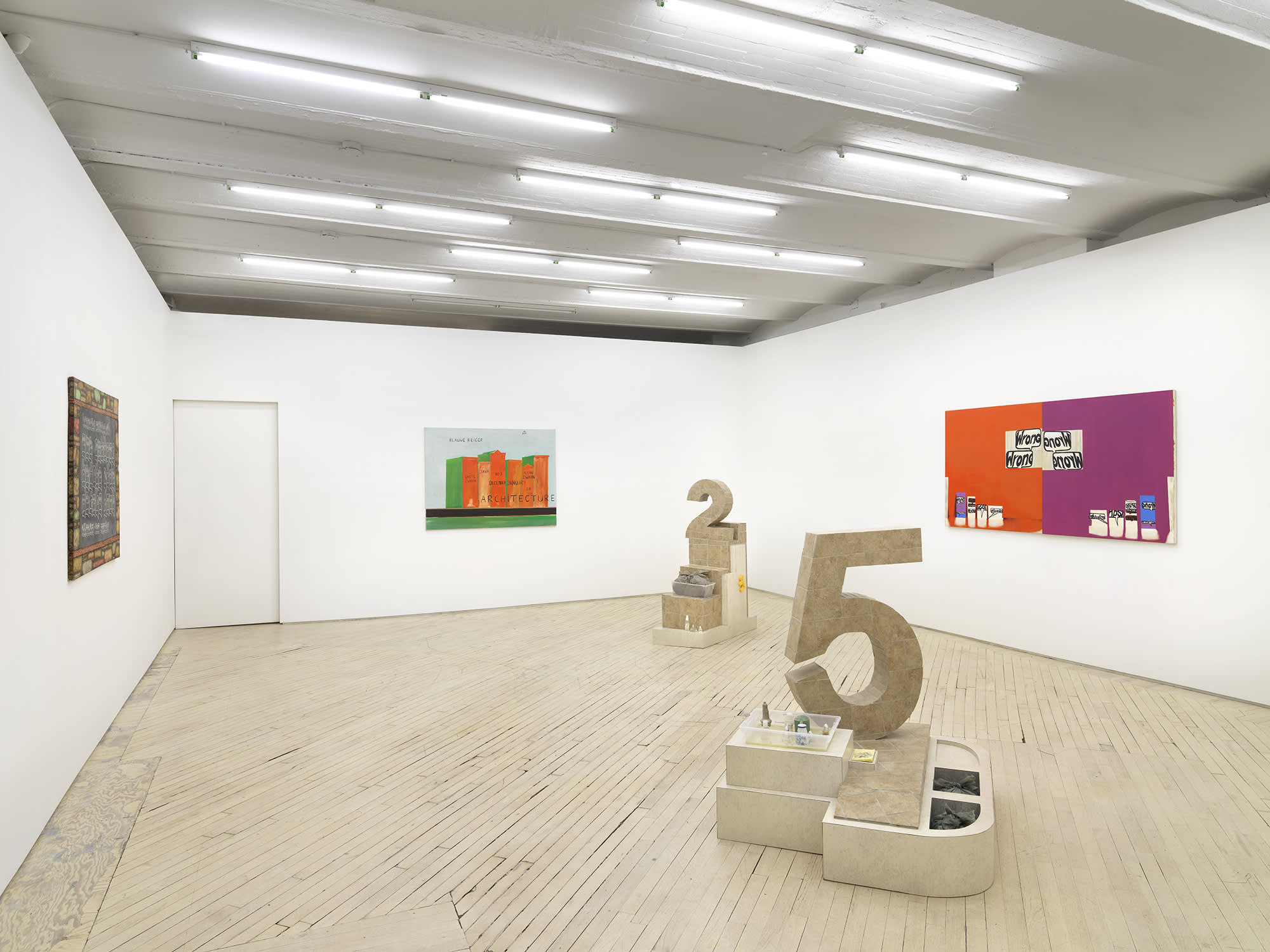
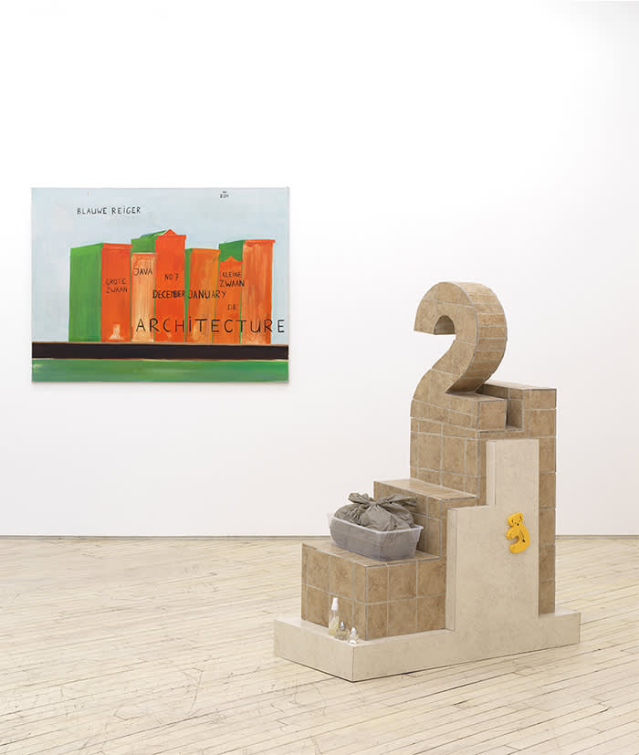
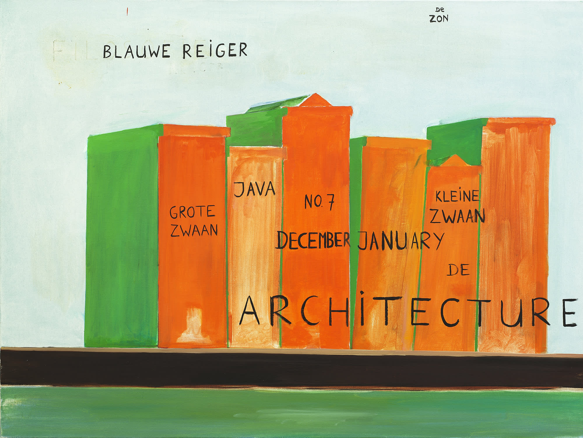
You know Alice and Dada were some of my first loves. I find a joy in the ease with which we can play with words and logic to say things which make no sense. The joy is now less freeing with the dissolution of truth in our current political state, but even more so, there is value in studying how pliable language and meaning can be. René Daniëls’s painting uses words to confuse the image he’s depicting; not in a straightforward non-equation like Magritte’s, but more enigmatic. In the painting, ‘Kades-Kaden’, Daniëls depicts a series of orange-faceted and green-shaded forms in the center of the canvas. Is the light blue background a sky? Is the horizon a shelf or a street? Scale is unclear, so perhaps we are looking at a group of books on a desk, or townhouses on a boulevard. Written over the orange rectangles, the word “Architecture” suggests buildings, but maybe it is a series of books about architecture? One unit is called Grote Zwaan, one Kleine Zwaan, big and little swan, respectively, in the artist’s native Dutch. The painting is, finally, I suppose, undecipherable, but a delight to puzzle over. Daniëls was famous for his mysterious scenarios, challenging the depiction of space and flatness on the picture plane. Flying above, in the cool sky background, is a kind of title, Blauwe Reiger: Great Blue Heron.
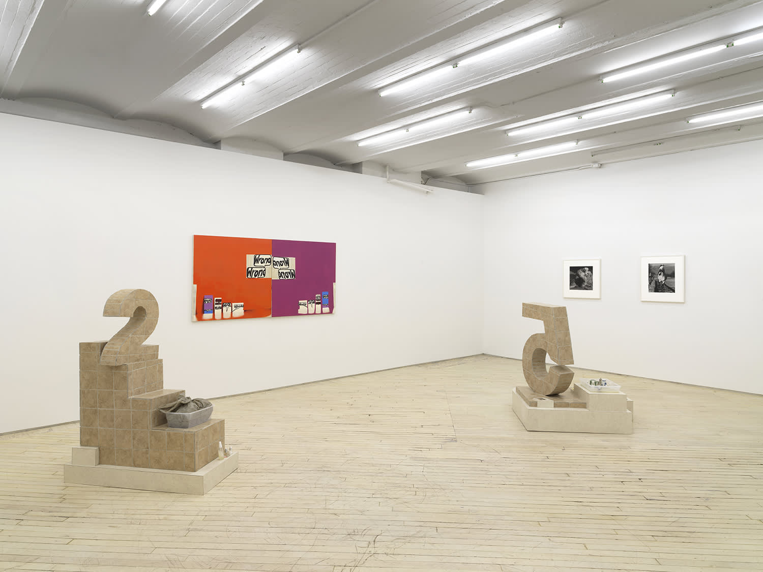
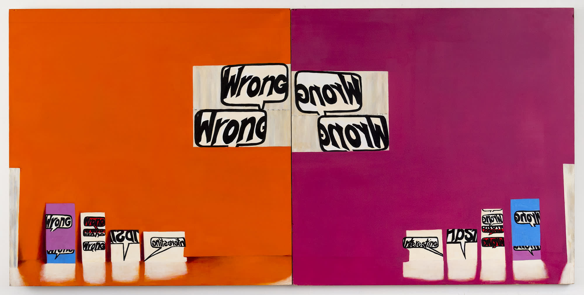
In a painting, a word can fly like a bird, or it can speak as the mouthpiece for the painting itself. In Rochelle Feinstein’s diptych, ‘Wrong Wrong’, the eponymous word appears multiple times: contained within comic speech bubbles and drawn out in the artist’s own hand-written font against stark and bright monochromes. The painting’s central axis, where the two canvases meet, serves as a mirror - the looking glass through which orange reflects as fuchsia. On the left, where there is a slight suggestion of an illusionistic space, the words are written forward, on the right they are mirrored in reverse. Wrong Wrong. It’s a chorus of criticism, but the painting anticipates it and thus beats its detractors. The repetition brings a rhythm and humor to the word, an absurd mantra of incorrectness, a delight in just never being right. This painting makes it feel ok to rest our minds in a place without certainty because forwards or backwards, it’s always wrong, and that’s that.
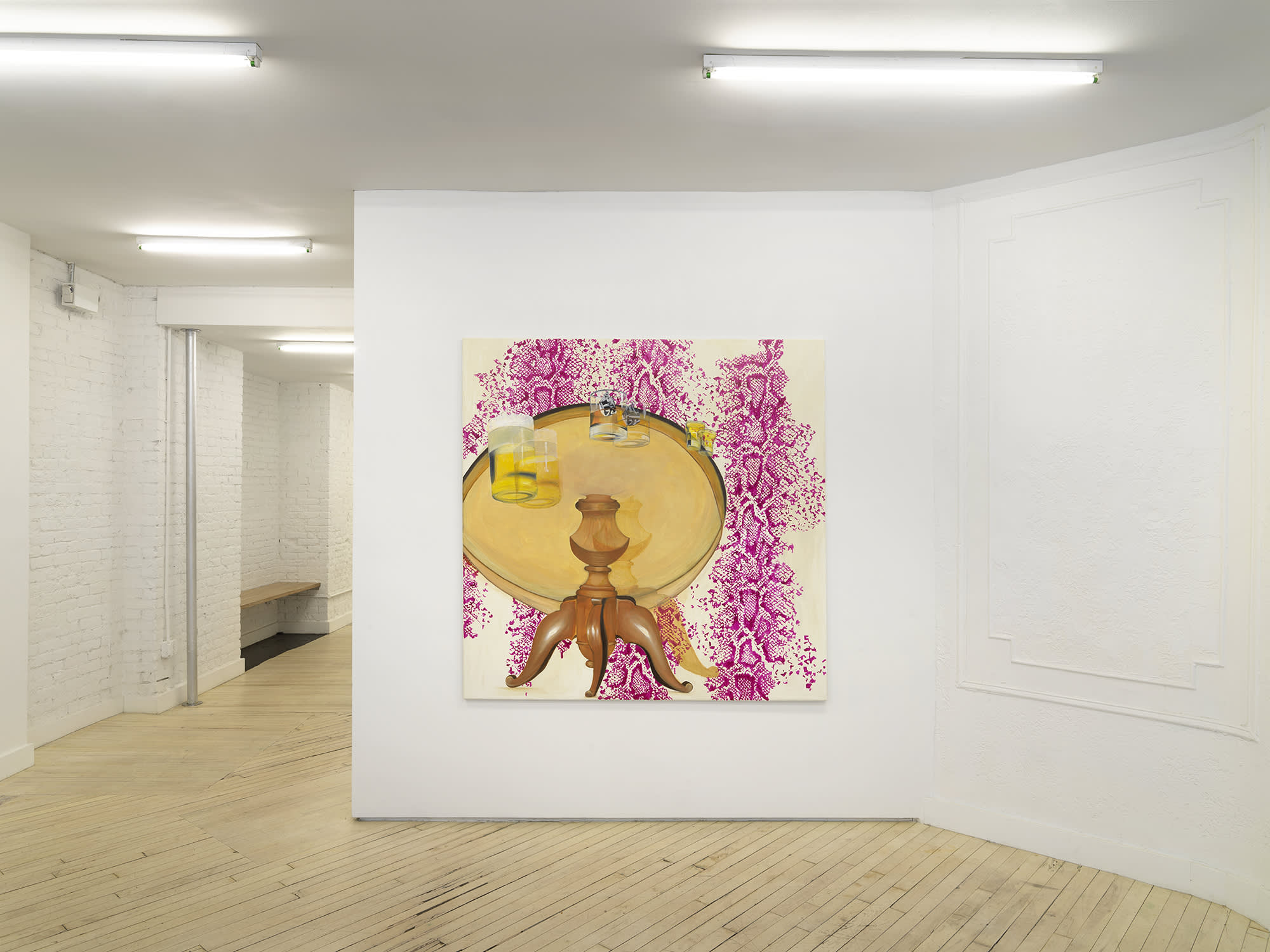
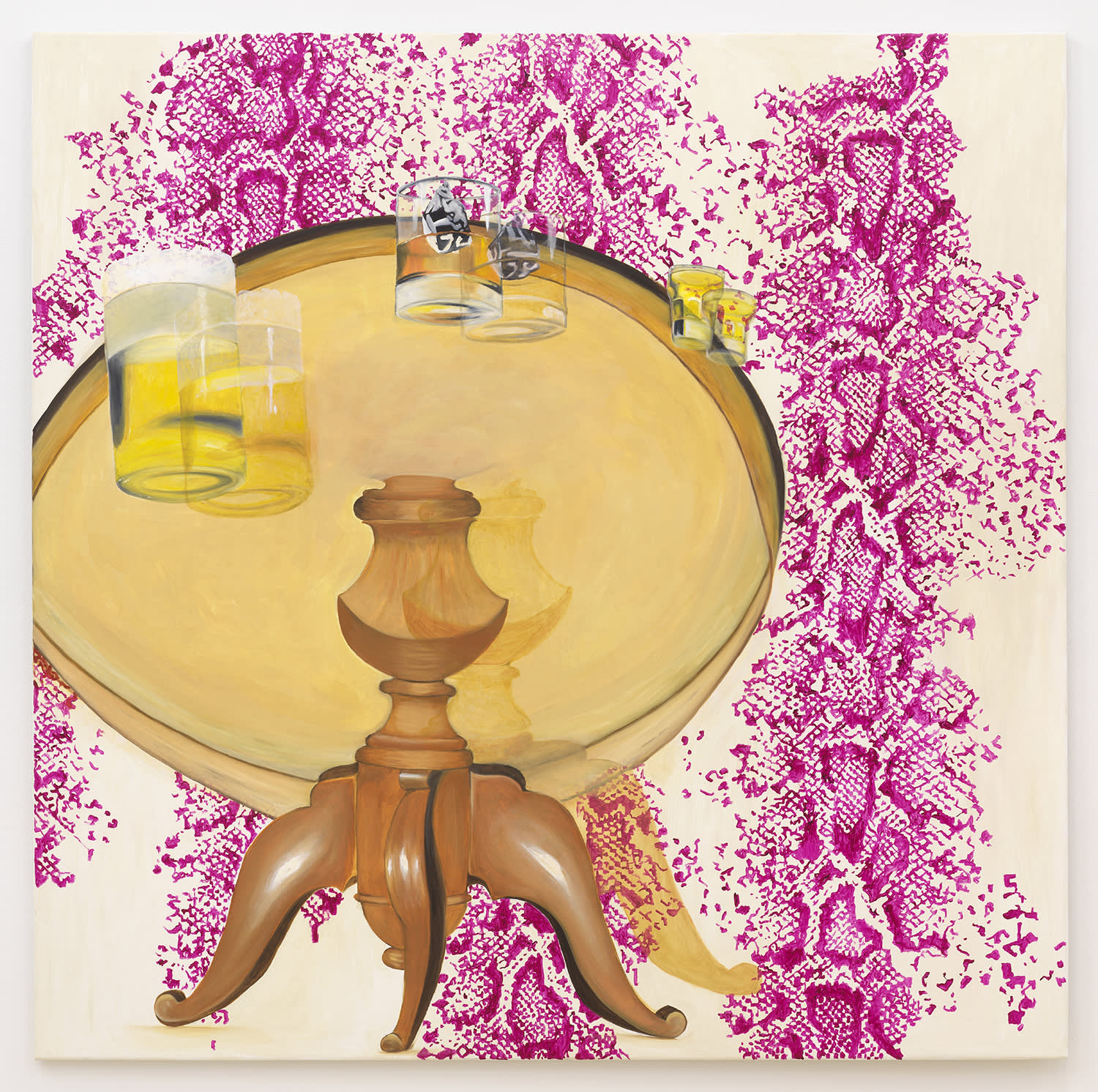
Quintessa Matranga’s painting also considers the ‘wrong’. Rather than using words, the depictions suggest a phrase or state of mind where things do not line up or make sense. The doubling here is our vision: we, the viewer, are together with the painter in an unusually confused perspective from underneath a table, where a trio of beverages hovers dizzyingly at the edge. Perhaps they are revolving in an orbit of choices so seductive when full and so disorienting when nearly empty. Gravity seems to affect things differently on this planet; beer foams out of its pint and a pair of black and white, marbled ice cubes nearly escapes the warm comfort of the whiskey glass(es). The yellowing, lacquered table floats amidst a field of magenta snakeskin. Close in, the woodwork of the central table leg seems utterly clear and stable: a pillar to cling to.
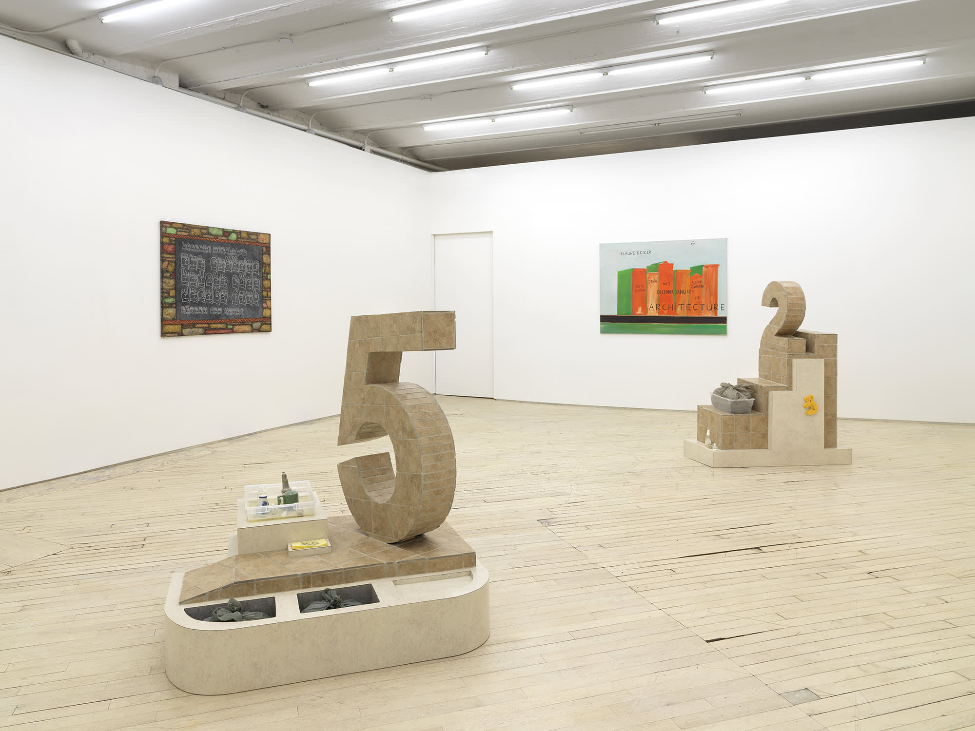
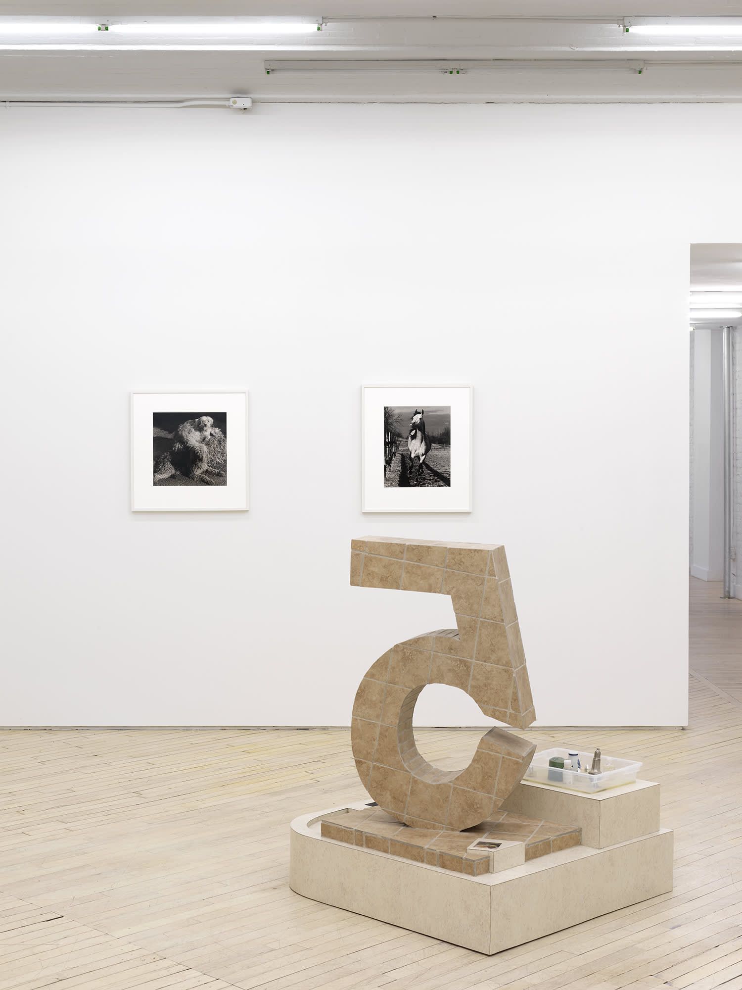
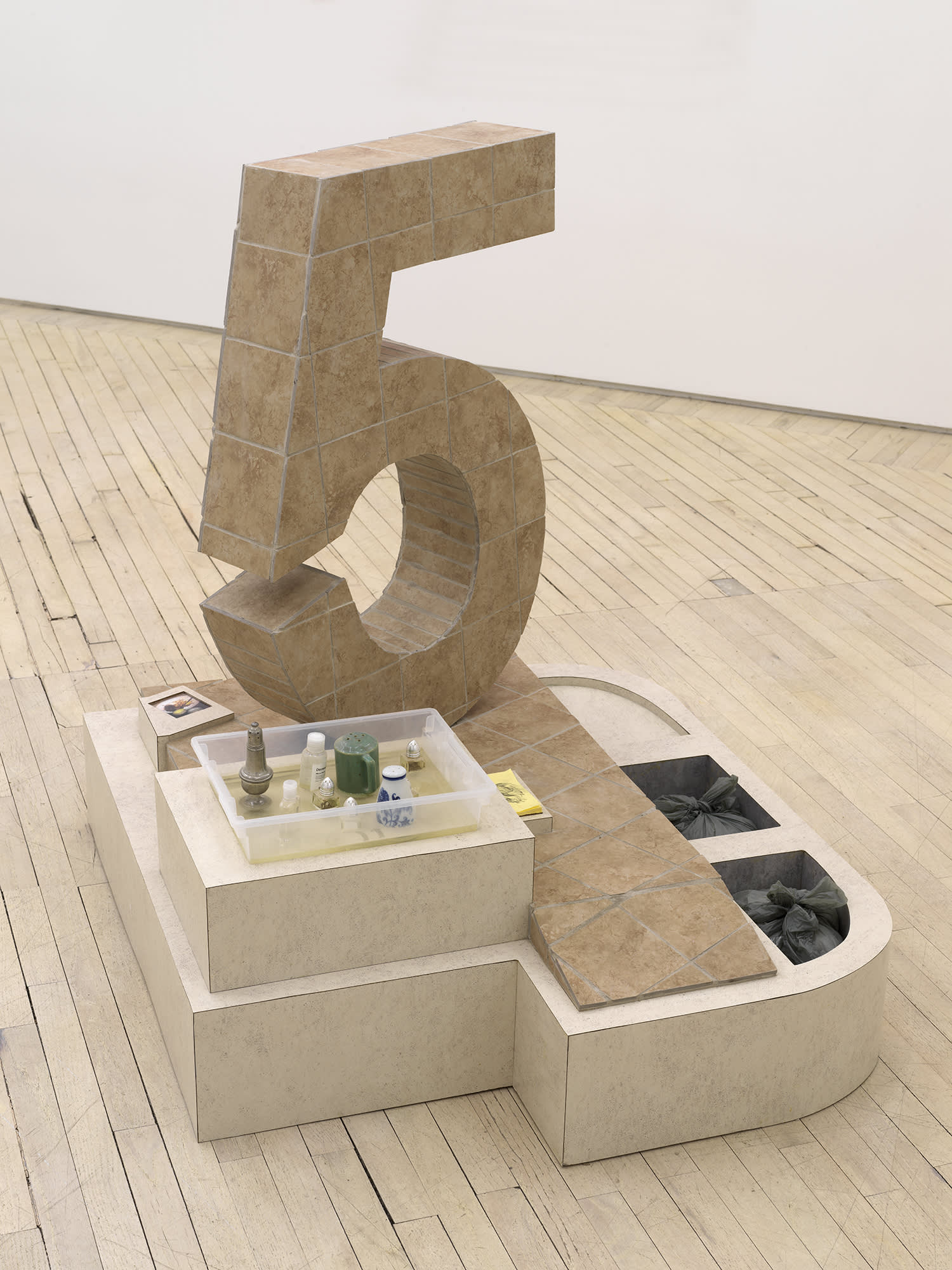
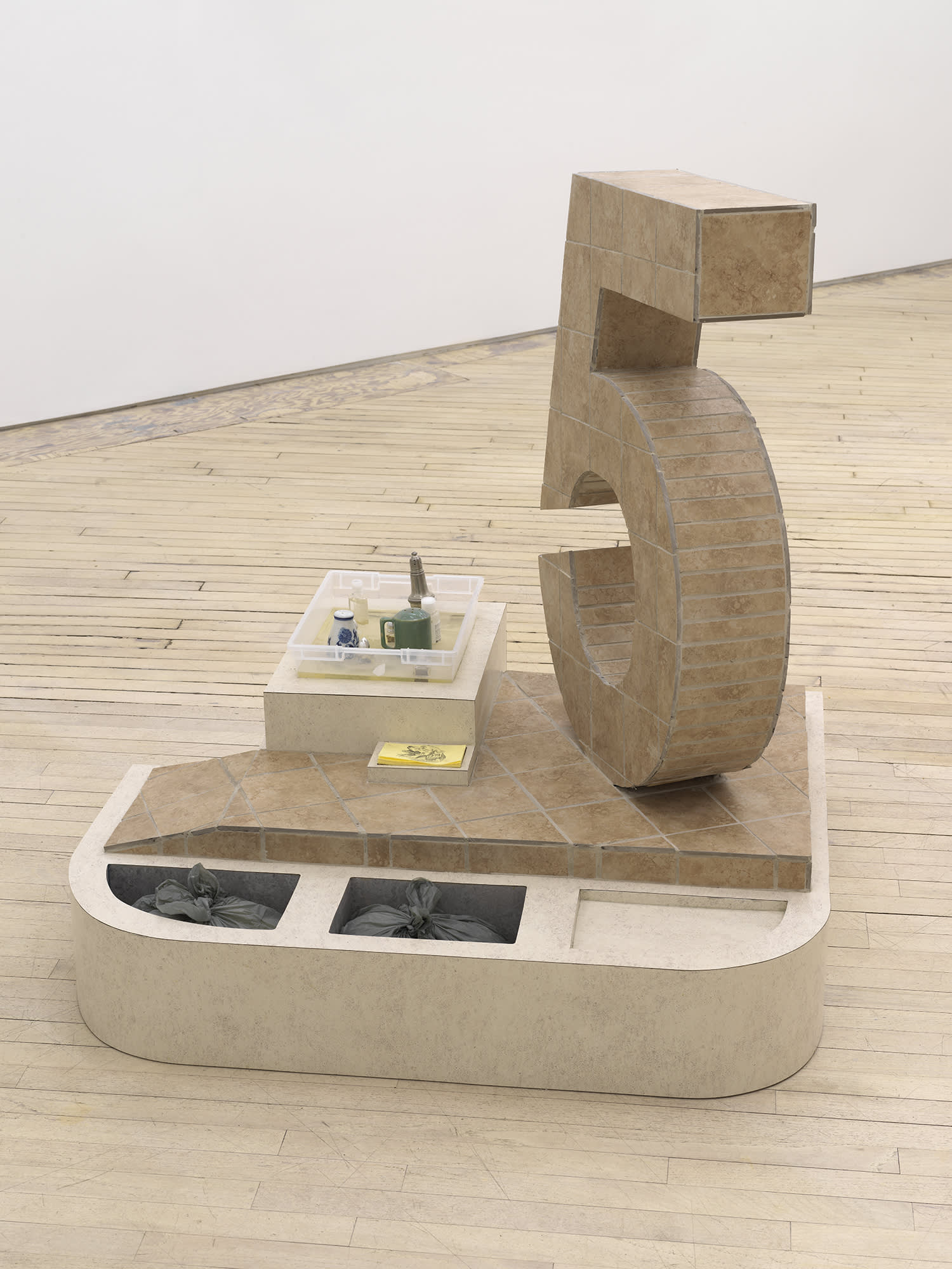
When I talked to Rochelle about Libby Rothfeld’s work, we shared a look of excitement, agreeing that Libby had guts to use the numbers “2” and “5” in her work. We all have deep associations with simple signs, and these numbers – indivisible, abstract, and so real, too – loom large in our minds. Sculpturally, these iconic numbers also have a dominant, central position in the exhibition. Each integer sits atop a stepped, tiled base; each piece a small universe. The sculptures are patinated with the most beige, basic laminate and tiles, as if to suggest a theoretical realm, a constructed possibility, not a depiction of a place. Libby’s work often wrestles with the problematics of taste and how our banal choices construct our identity. What does it mean to place a number in space? We speak numbers, use them, play with them, show signs of them on paper and with our hands, but how do they stand? Her sculptures offer, to me anyway, an expression of how logic feels. We don’t often get to stand next to a number, to a choice, to look concretely at the building blocks of logic.
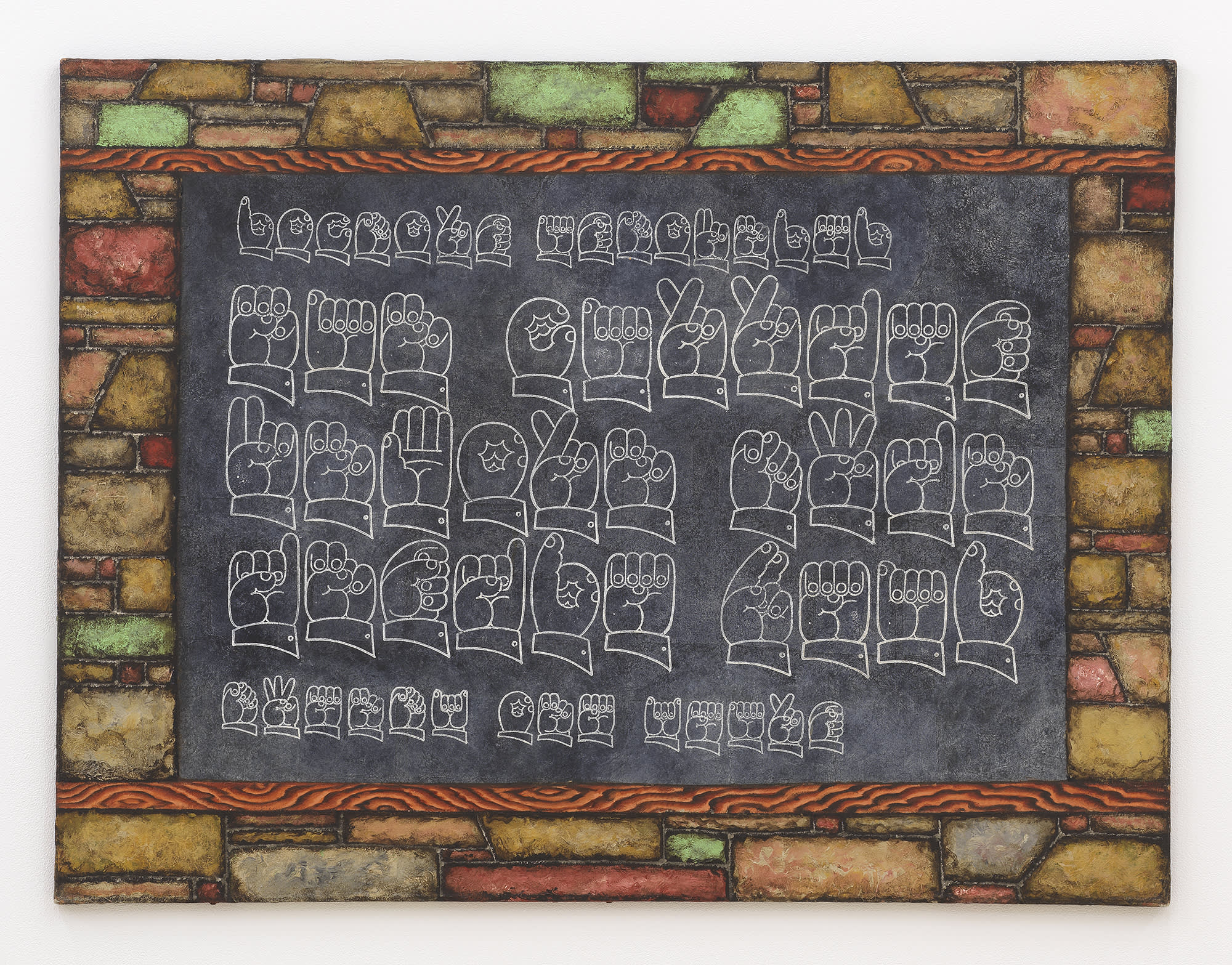
I am really thrilled to be able to show Martin Wong’s work in this context. The painting that we’re showing is one of his sign-language works. It has this incredible trompe-l’oeil tile frame, which I am excited to see in the same room as Libby’s work. I love the way Wong used bricks as a kind of repeating texture in so many of his works - within these patterned, crowded structures, intimate spaces and hidden identities emerge. Wong was obsessed with codes and language, too. Some of his paintings showed the zodiac, a system invented to make sense and stories of the stars. Taken from what was probably a tabloid paper, this painting shows a series of hands spelling out a headline in ASL: “doctors astounded / man carries / unborn twin / inside head / twenty one years.” What an idea: to draw hands spelling in ASL. Written words or a picture would have sufficed for a deaf person, but Wong wanted to employ a code to translate his subject and make it more obscure. Anneliis, who works on Wong’s estate at his gallery, also mentioned that he was really interested in the constellation of Gemini in particular and the nature of twins as the poetic potential of a perfect genetic match but an imperfect mirror.
This show features all sorts of translations and miscommunications through mirrors and double vision. In incantations and exclamations, we name in order to protect, confuse or enrich meaning. I like the idea of you experiencing this work first through my words – another translation.
Love, G *Jennifer Kronovet, The Wug Test, (New York: Harper Collins, 2016)
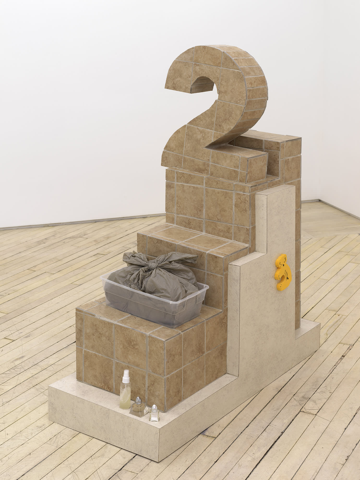
Libby Rothfeld, Who am I? Who am I! (#2), 2020, Laminate, tile, grout wood, plastic bag, plastic storage tub, salt shaker, pepper shaker, resin, spray bottle, ink jet print, plexi, foam koala, 55 × 18 ¼ × 42 ½ in.
